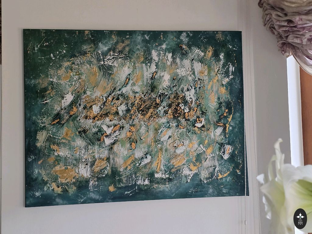
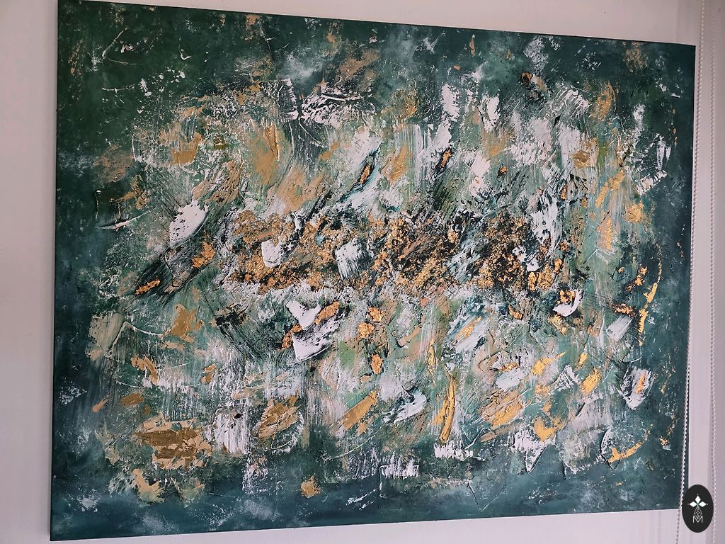
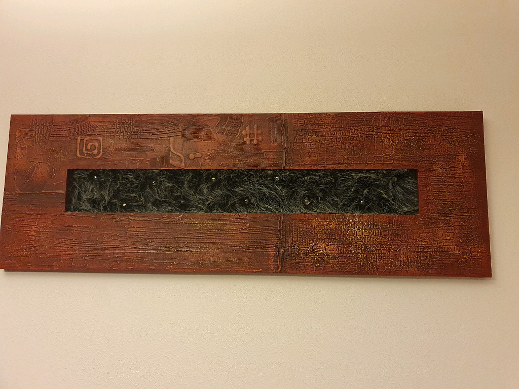
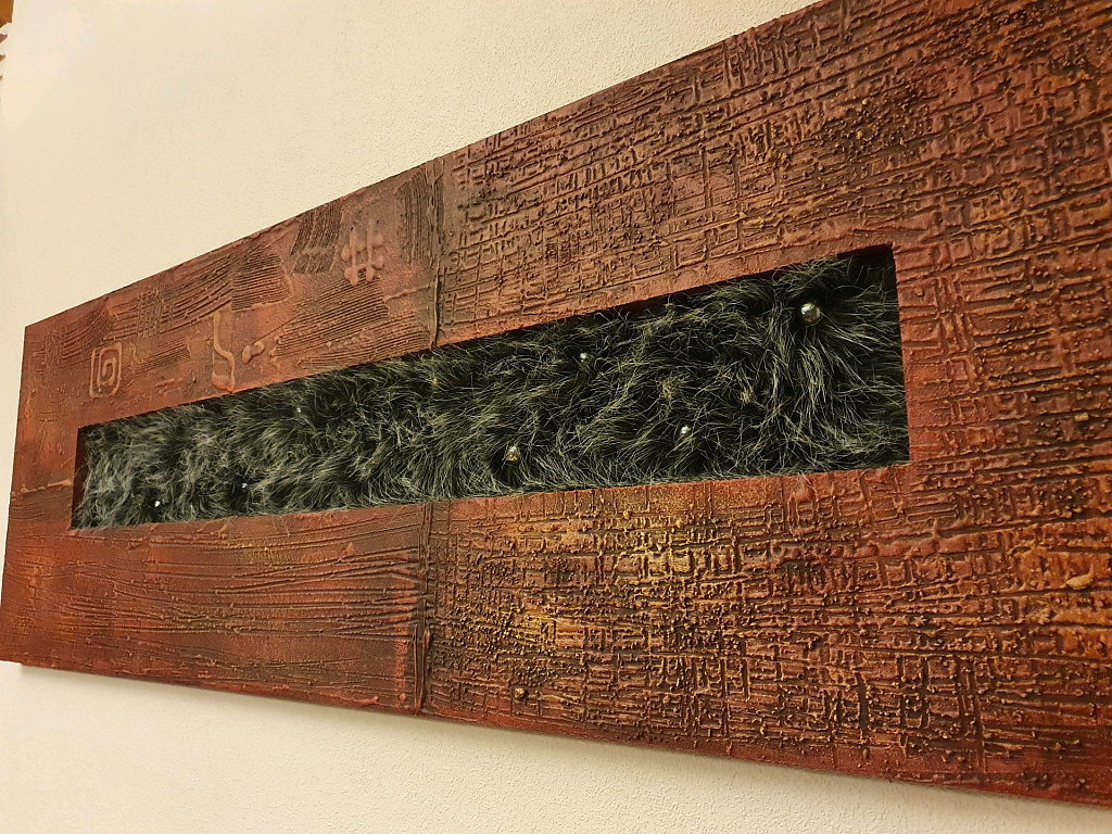
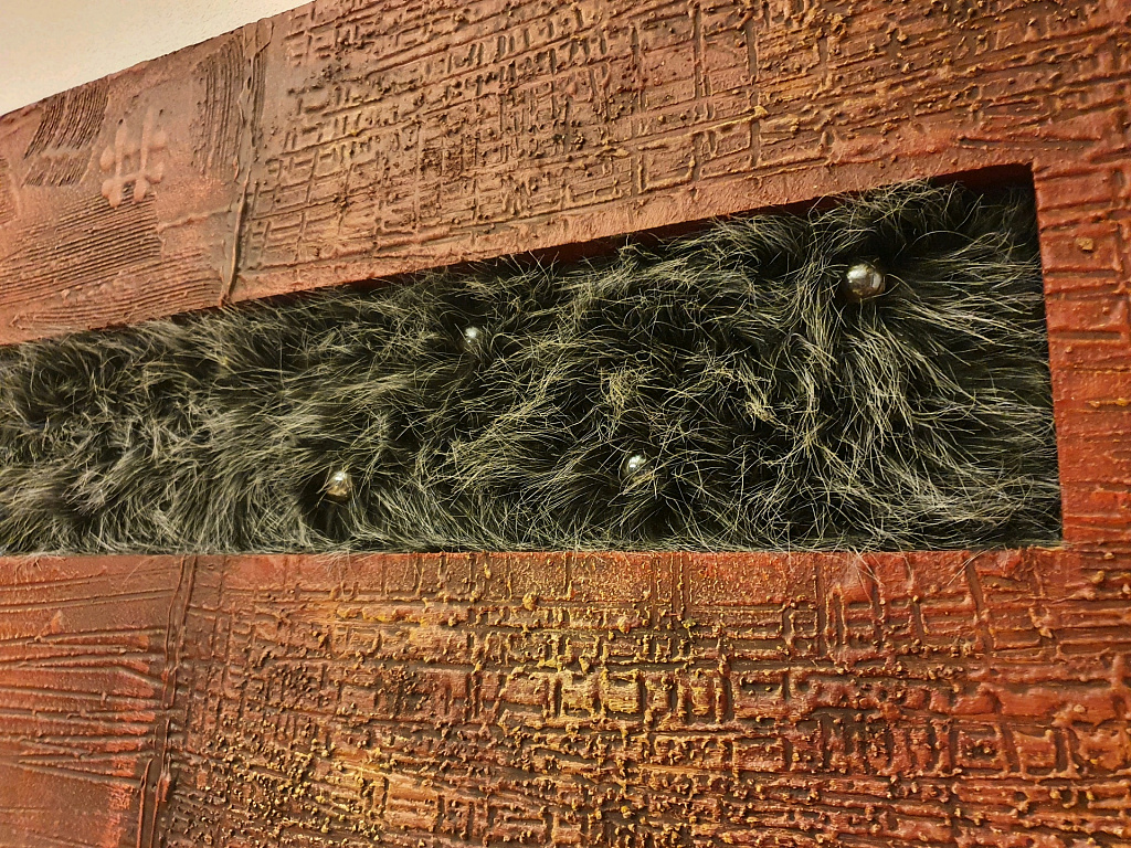
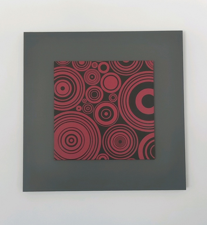
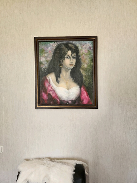
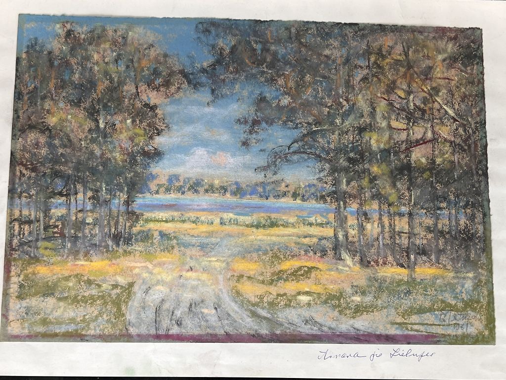
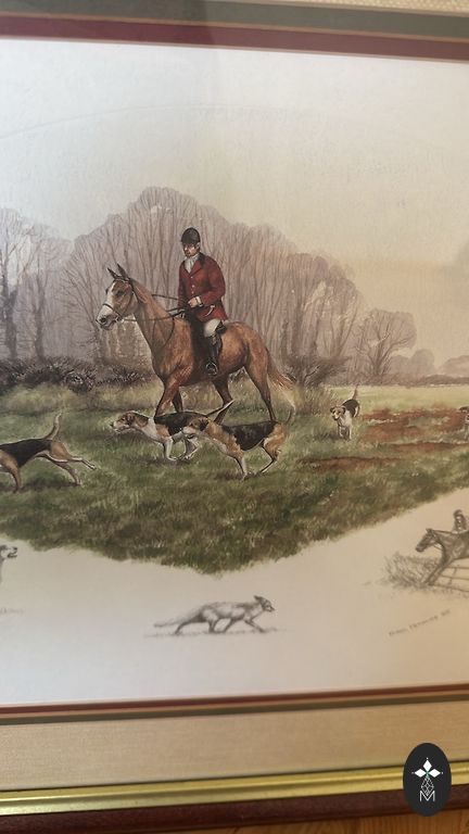
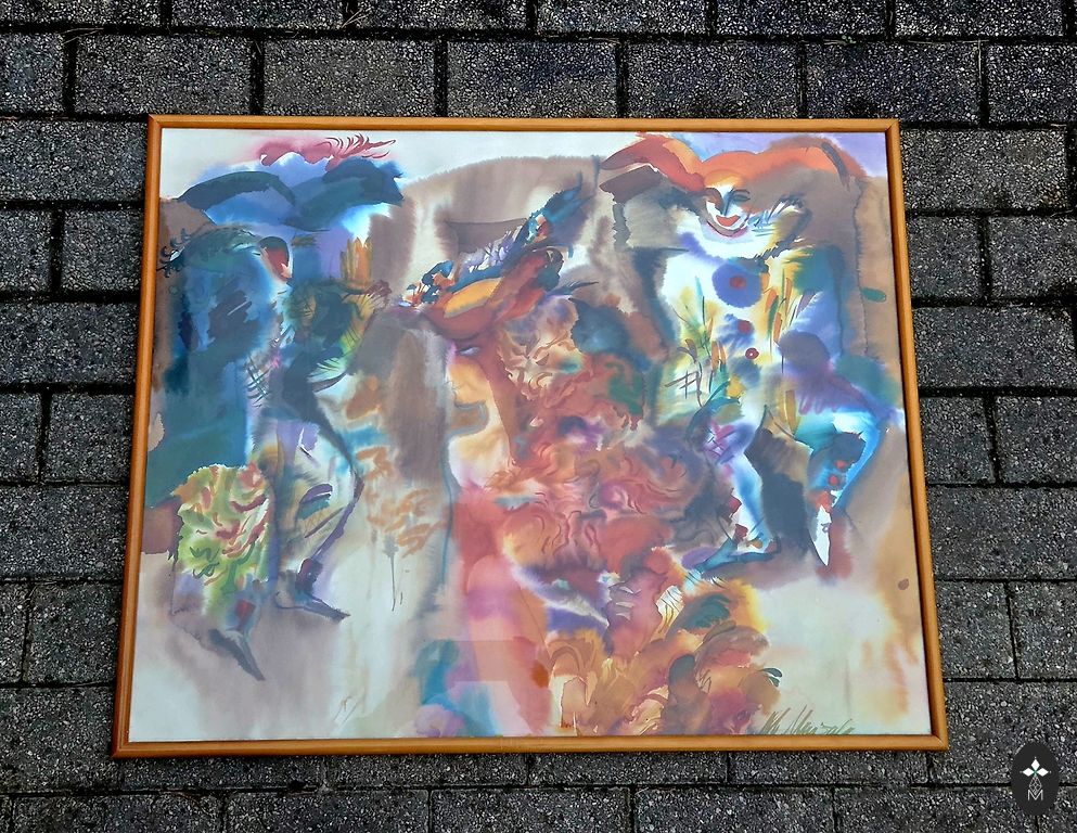
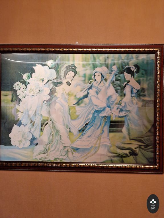
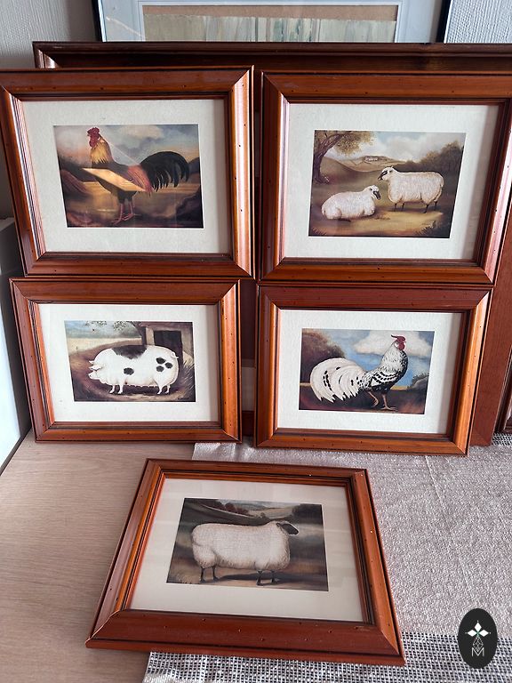
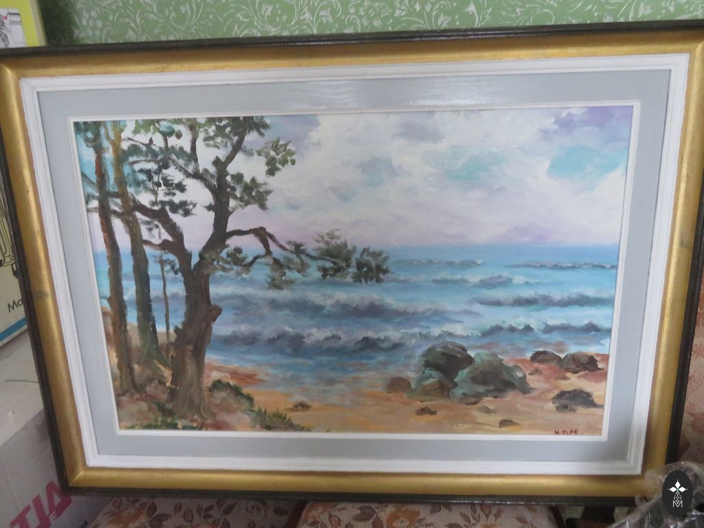
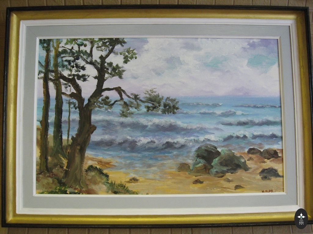
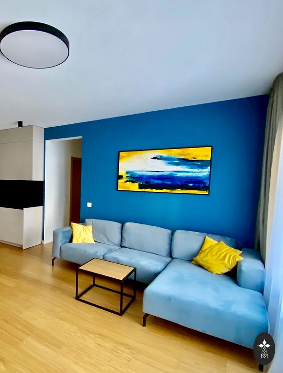
Modern picture
| Colour | Khaki |
| Condition | Used, in perfect condition |
| Added | March 16, 15:5049 |
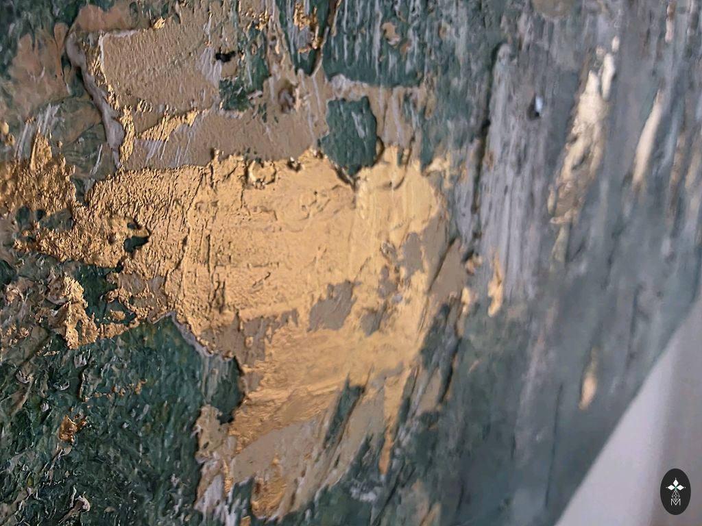
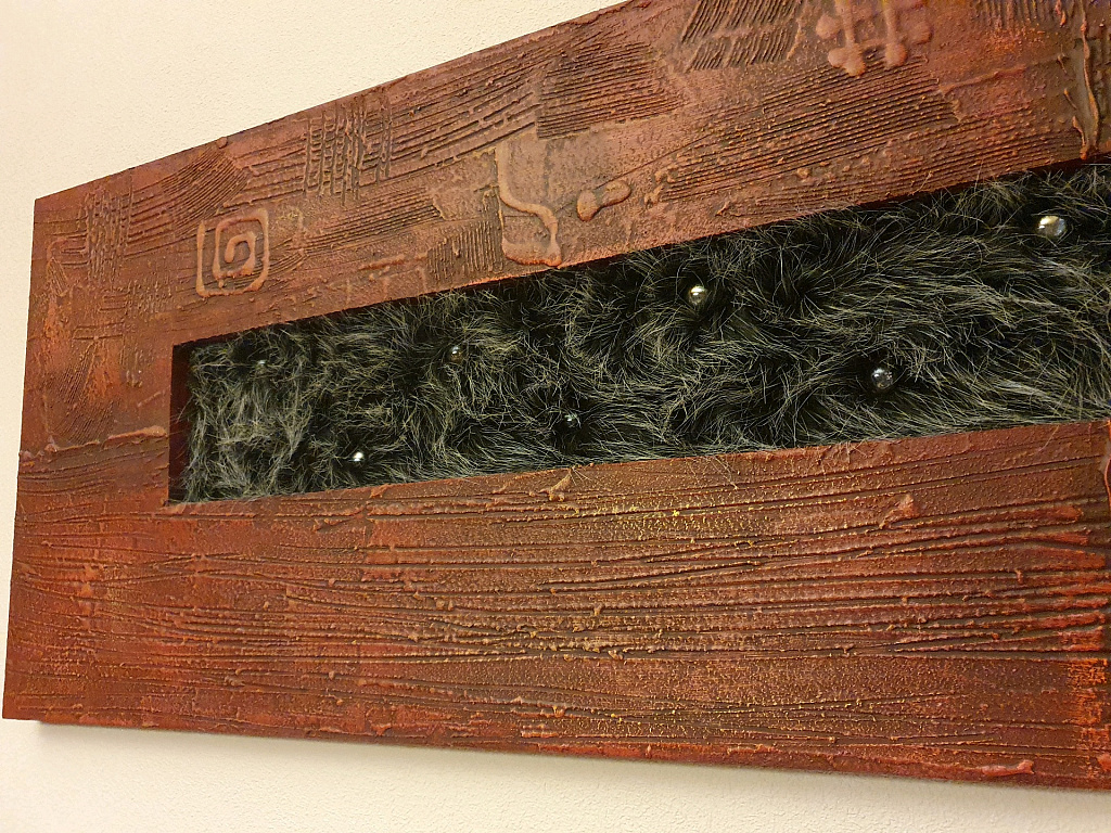
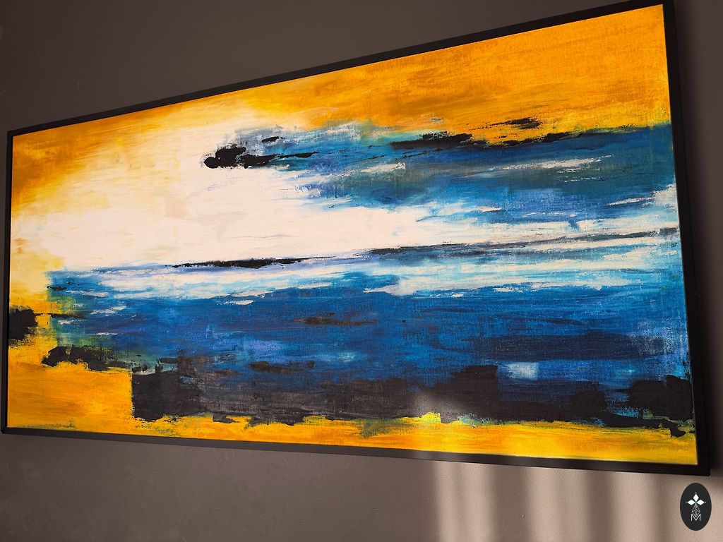
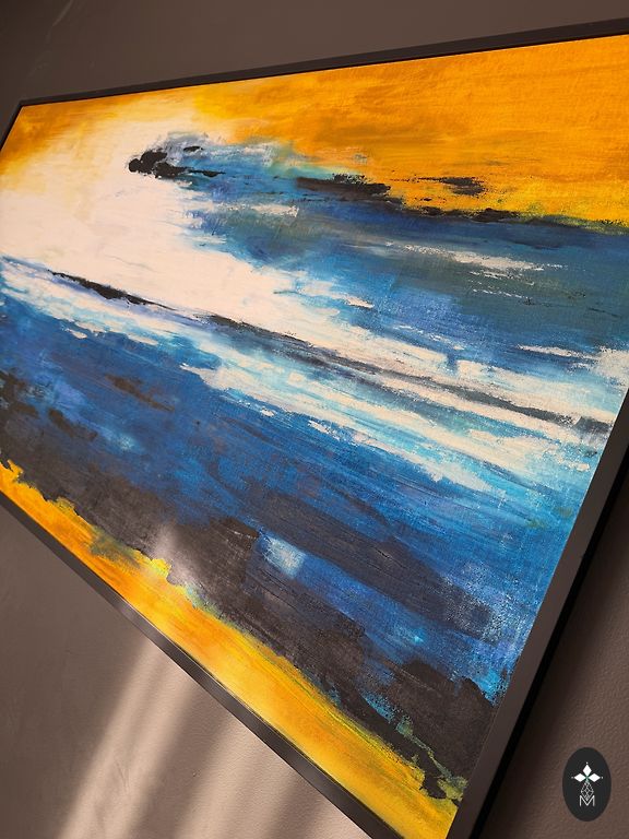
2. Krāsu palete
Krāsas rada izsmalcinātu, dabisku kontrastu:
Dziļi meža un smaragda zaļie toņi: tie kalpo kā tumša, stabila pamatne.
Tīri baltais: izmantots, lai radītu "gaismu" un kustību, liekot tumši zaļajam tonim izcelties.
Metāliski zeltainais: galvenais akcents. Tas piešķir greznību un siltumu, imitējot tīrradņa zeltu vai saules atspulgus uz tumšas meža augsnes.
3. Tekstūra un tehnika
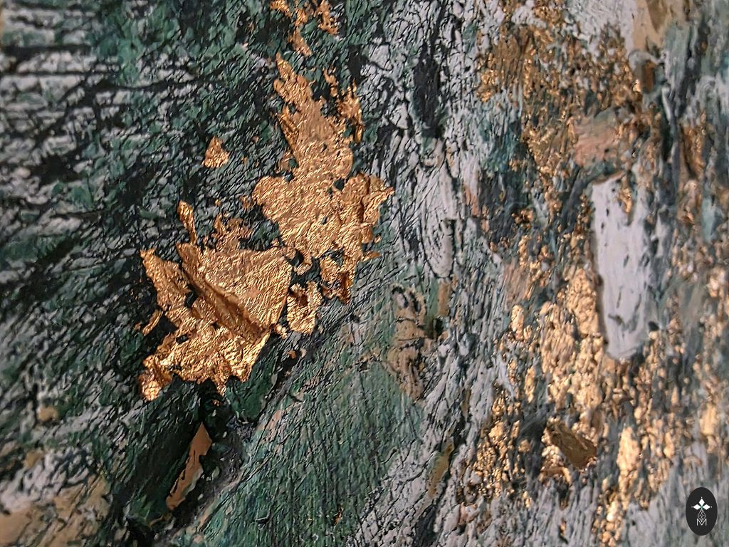
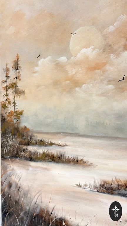
Tuvplāni (12616 un 12614) atklāj, cik fiziski dziļš ir šis darbs:
Impasto: Mākslinieks krāsu uzklājis ļoti biezā slānī, visticamāk, izmantojot paletes nazi (mastihīnu), nevis tikai otas. Var redzēt rievas un "virsotnes" vietās, kur instruments ticis atrauts no audekla.
Jauktā tehnika / Apzeltīšana: Zelts izskatās pēc metāla folijas (potāles) vai smagām pārslām, nevis vienkāršas krāsas. Tas, kā zelts "sēž" uz zaļajām korēm, piešķir darbam 3D skulpturālu efektu.
Sgrafito: Vietām šķiet, ka mākslinieks ir skrāpējis cauri augšējiem slāņiem, lai atsegtu apakšējās krāsas, kas papildina darba dabisko, ģeoloģisko izskatu.
Kāpēc tas darbojas
Tekstūras "haosu" līdzsvaro ierobežotā krāsu palete. Tā kā autors ir pieturējies pie trim galvenajiem toņiem (zaļš, balts, zelts), darbs šķiet mērķtiecīgs un vienots, nevis nekārtīgs. Šī ir māksla, kas mainās atkarībā no apgaismojuma telpā — zelts visas dienas garumā atstaros gaismu citādāk. ">
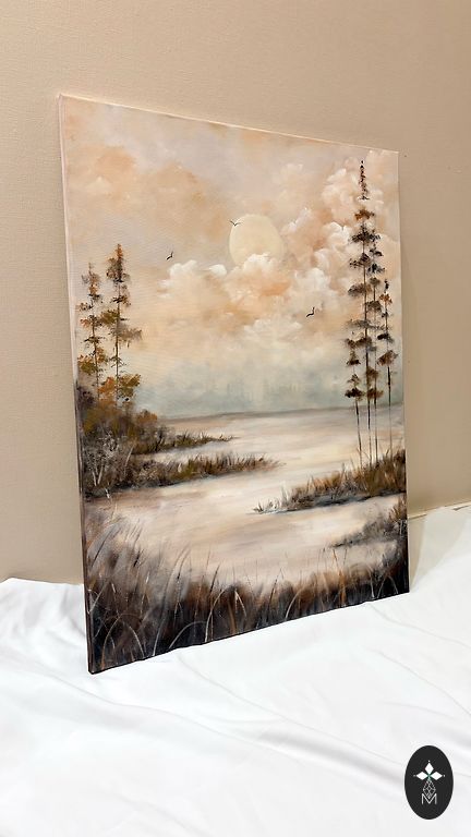
captured impressive contemporary abstract artwork. It has a very organic, almost "elemental" feel — as if looking at a mineral cross-section or coastline from a bird's-eye view.
Here is an analysis of the visual elements and techniques of this work:
1. Composition and Style
The painting is done in the style of abstract expressionism, where texture and emotions are more important than a specific plot. The composition is centripetal: the main visual energy and thickest layers of paint are
concentrated in the center, gradually "fading" towards the edges. This creates a flare or nebula effect.
2. Color Palette
The colors create a sophisticated, natural contrast:
Deep forest and emerald greens: they serve as a dark, stable base.
Pure white: used to create "light" and movement, making the dark green tone stand out.
Metallic gold: the main accent. It adds luxury and warmth, imitating nugget gold or sunlight reflections on dark forest soil.
3. Texture and Technique
Close-ups (12616 and 12614) reveal how physically deep this work is:
Impasto: The artist applied paint in very thick layers, likely using a palette knife (mastichin) instead of just brushes. Grooves and "peaks" can be seen where the tool was lifted off the canvas.
Mixed Technique / Gilding: The gold looks like metal foil (potales) or heavy flakes, rather than simple paint. How the gold "sits" on the green ridges gives the work a 3D sculptural effect.
Sgraffito: In places, it seems the artist has scratched through the top layers to reveal the underlying colors, enhancing the work's natural, geological appearance.
Why it Works
The "chaos" of textures is balanced by the limited color palette. Since the author has stuck to three main tones (green, white, gold), the work appears purposeful and unified, rather than messy. This is art that changes depending on the lighting in the room — the gold will reflect light differently throughout the day.